Published on February 28, 2014.
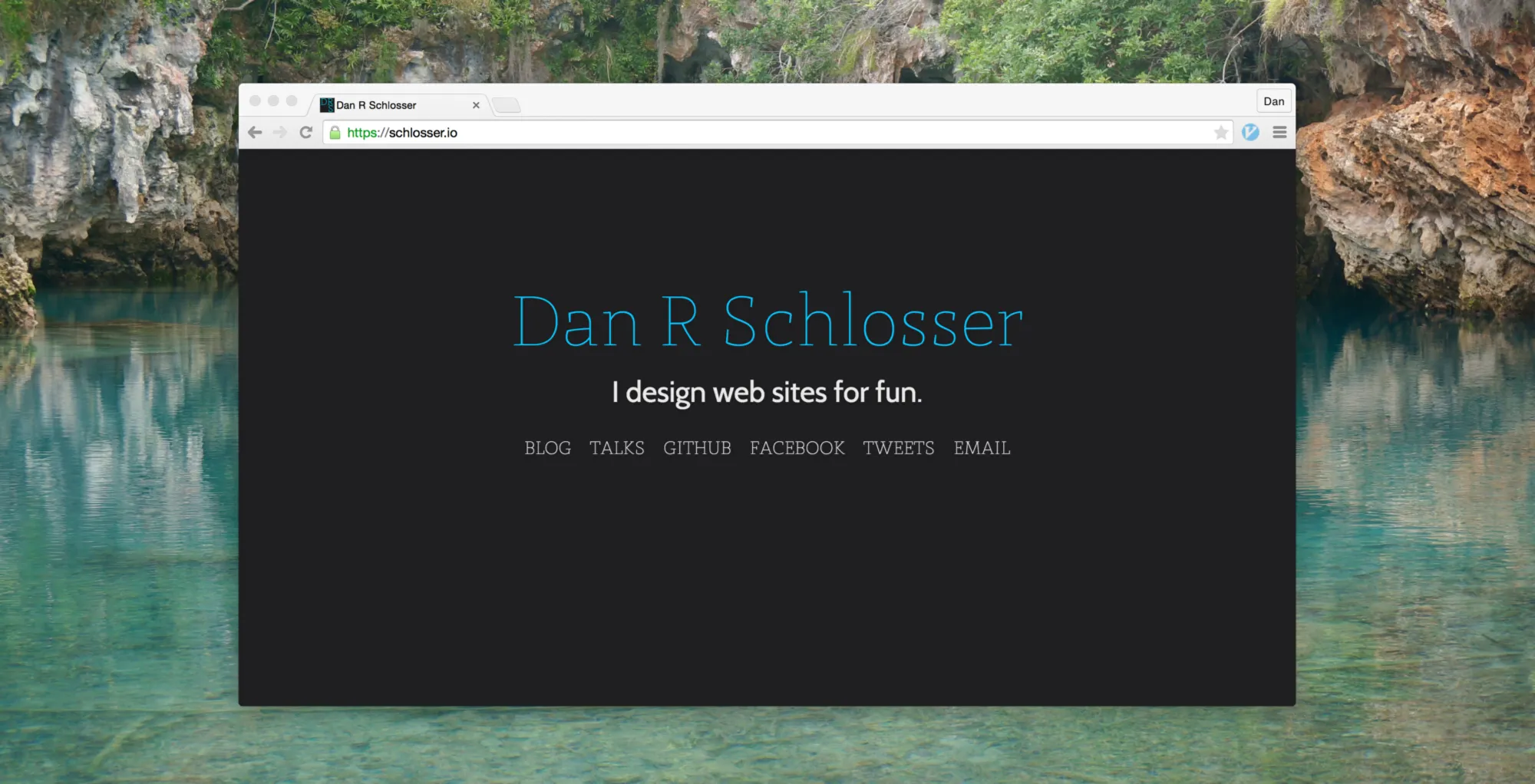
There comes a time where I get just bored enough that I’m restless and not so bored that I’m lazy. During these times, I code myself a website, usually from scratch. The last time was around finals season of last year, and it resulted in the first iteration of my personal website (which despite my best intentions was bloated and ugly). Anyway, it’s happened again, and so now I have a new website. Hope you enjoy it!
I had a pretty simple concept for this new site and it didn’t take all that long to roll out, but along the way I ran into some pretty funky bugs, many of which almost brought me to tears.

The Rotating Tagline
My new website was really supposed to be simple, I swear. Just my name, how to contact me, and a blog post or three. After I drew together a mockup however, I quickly began to feel that I needed something more fun. From that urge came the idea for a rotating tagline. I could just throw a couple of sentences in to JavaScript and have it cycle through them. Simple.
The basic pseudo-code for my JavaScript is as follows:
every 6 seconds:
    do:
        newSentance := someRandomSentance()
    while numWordsShared(newSentance, currentSentance) < 1
    for each newWord, oldWord in newSentance, currentSentance:
            if newWord != oldWord:
                oldWord.fadeOut()
                containerForWord.resize(newWord.width())
                newWord.fadeIn()
        currentSentance := newSentance
Challenges here start with newWord.width(). How do you find the width of arbitrary text in JavaScript? My first instinct was to write some function that takes the text size and number of characters and interpolates, but as you can imagine this was a nightmare on one browser, never mind multiple. Even if I were to have used a fixed width font (I considered it), slight differences in text rendering yield jumps in the animation, or text that is cut off. No, I’d have to try something else.
After some creative Googling, I found and adapted a function that calculates text width by creating an invisible text element on the page with the same styling as the text in question. Take a look:
function calculateWordWidth(text, classes) {
  classes = classes || [];
  classes.push("textDimensionCalculation");
  var div = document.createElement("div");
  div.setAttribute("class", classes.join(" "));
  div.innerHTML = text;
  document.body.appendChild(div);
  var width = jQuery(div).outerWidth(true);
  div.parentNode.removeChild(div);
  return width;
}
Fairly straightforward, but definitely non-obvious. The element is created, given all the classes passed in, and then given the testDimensionCalculation class, which makes it invisible and absolutely positioned (as to not interfere with any elements the user can see):
.textDimensionCalculation {
  position: absolute;
  visibility: hidden;
  height: auto;
  width: auto;
  display: inline-block;
  white-space: nowrap;
}
After the width of the <div> is calculated, it is destroyed.
With the width of the text determined, the next step would be to implement the word replacement. The markup, it turns out, was more challenging than I would have expected. My first instinct was to wrap each word in a <span>, and manipulate them in JavaScript:
<div class="sentence">
  I <span class="verb">verb</span>
  <span class="obj">object</span>
  <span class="preposition">preposition</span>
  <span class="noun">noun</span>.
</div>
Consider animating from the word “preposition” to the word “about”, however. When the width of the <span> is animated, the text starts to break up into multiple lines , and the height of the <span> increases randomly. This causes spastic jumping of different words during the animation. In order to smoothly animate words, I put each <span> in a container, and added another <span> to control the actual width of the container. Both <span> elements contain the same text, but one has an invisible class, and the other has a visible class.
<div class="sentence">
I
<div class="word verb">
<span class="verb">verb</span>
<span class="verb">verb</span>
</div>
….word {
display: inline-block;
height: 2.5rem;
position: relative;
text-align: center;
overflow: hidden;
}
.word span {
top: 0;
position: relative;
overflow: hidden;
display: inline-block;
}
.visible {
height: 2.5rem;
display: inline;
position: absolute;
bottom: 0;
right:0;
0;
}
.invisible {
visibility: hidden;
}The way this works is that the container doesn’t ever have a width applied to it, rather the invisible <span> expands and shrinks. The visible <span> has absolute positioning, so it has no influence on the size of its container. Then, in order to change between to words, I fade out the visible <span>, animate theinvisible <span> to the new width, and then fade in the visible <span>.
For alignment reasons, and because <div>s around all the words removes whitespace, I actually had to add <div class="word"> elements containing just and wrap I and . in <div> tags as well.
<div class="sentence">
<div class="word">
<span>I</span>
</div>
<div class="word">
<span> </span>
</div>
<div class="word verb">
<span class="visible">verb</span>
<span class="invisible">verb</span>
</div>
<div class="word">
<span> </span>
</div>
<div class="word obj">
<span>object class="visible"</span>
<span class="invisible">object</span>
</div>
<div>…</div>
</div>I had never heard of this being a problem before, but I actually ran into whitespace issues between the <div> elements that are display: inline-block;, which was solved most simply by removing any space after the closing tag of the <div> (</div><div class=…). It was a massive pain across different browsers. Some browsers would display the sentence just as I expected, others would cut off part of the words, others would have an unnatural amount of spacing, etc. The whitespace logic of HTML still deceives me, and because it’s so loosely defined, there’s no way to understand whether or not you’re being compliant.

Animated Name Abbreviation
When I was designing my blog, I wanted a fairly chromeless interface. I don’t need any fancy widgets, menus, other links, or pages. My website is really just the splash page and my blog, so there really isn’t anywhere else to go. I did want a link back to the splash page from the blog though, so without any navigation bar there wasn’t really any place to put it.
Enter my ridiculous idea for my name to animate into my initials and pin to the upper left corner of the screen as you scroll down the page. I made it work for screens wider than 1024px, and lucky for me this behavior doesn’t make sense on any smaller screens (because even if it did the JavaScript couldn’t run on the mobile devices).
In order to achieve this, I calculate the percentage left in the animation as the (positive) percent of the total distance between the title and the top of the page that the user has scrolled:
var distanceToTop = $title.offset().top - $(window).scrollTop();
…
var percentageLeft = Math.max(distanceToTop, 0)/$title.offset().top;
So if the Title is 200px from the top of the screen, and the window has been scrolled 100px, then the animation will be 50% complete.
Now what is being animated? I separate all the parts of my name into fragments, and animate each one appropriately. This way, I can animate the lowercase letters and the spaces between my first, middle, and last name to zero, leaving my initials untouched.
<div class="name-fragment">
<span>D</span>
</div>
<div class="name-fragment fragment-first">
<span>an</span>
</div>
<div class="name-fragment fragment-nbsp">
<span> </span>
</div>
<div class="name-fragment">
<span>R</span>
</div>
<div class="name-fragment fragment-nbsp">
<span> </span>
</div>
<div class="name-fragment">
<span>S</span>
</div>
<div class="name-fragment fragment-last">
<span>chlosser</span>
</div>I used the same calculateWordWidth() function to find the starting and ending widths of all of the name-fragment <div>s, and then I animated each of them incrementally from the starting to ending width based on percentageLeft.
That process is pretty simple: figure out what stage of animation each piece should be in based on the distance scrolled from the top of the page, and then animate each element’s width appropriately. Where things get complicated is making this process responsive to screen size changes and compatible with multiple browsers.
Making it all Cross-Browser Compatible
I knew I wanted my name to stay at the top of the page on mobile, but that brought up the problem of what if a desktop user was part of the way down the page and then resized from full width to tablet width or vice versa. I already had my animation function updateTitle() bound to the window scroll event, but then I realized that I also needed to bind it to window resize:
$(window).scroll(updateTitle);
window.addEventListener("resize", updateTitle);
Then, in updateTitle() I either update the animation if the screen is desktop width, or set the title to be at the top of the page on tablets and mobile.
function updateTitle() {
    if ($(window).width() > 1024) {
        // Animate the title's width appropriately
        …
    }
    else {
        doMobile();
    }
}

function doMobile() {
    // I set everything to it's original width and ensure that the
    // title isn't fixed to the side of the screen.
    $title.removeClass("fixed");
    $fragmentNBSP.css({"width": nbspWidth()});
    $title.css({"width": titleOriginalWidth()});
    $fragmentFirst.css({"width": fragmentFirstOriginalWidth()});
    $fragmentLast.css({"width": fragmentLastOriginalWidth()});
    $fragmentFirstInnerText.css({"width": fragmentFirstOriginalWidth()});
    $fragmentLastInnerText.css({"width": fragmentLastOriginalWidth()});
}
Seems right, but I had forgotten something: orientation changes on mobile. Because when you rotate the screen neither the page scroll event or the window resize event are called, updateTitle() is never called despite the fact that the window size is different, and therefore all the elements are lined up improperly.
The fix is easy, but I’m lucky I caught this, it’s not often that I rotate my device in the middle of browsing a web page.
window.addEventListener("orientationchange", updateTitle);I didn’t know about this until it started causing me trouble, but apparently, scrolling with a scroll wheel on a mouse is actually different from the browser’s perspective than scrolling on a trackpad. As a result, when I used a traditional mouse to scroll on my site, sometimes the updateTitle() function would not be called, or would be called unpredictably.
The fix should have been easy: bind updateTitle() to the wheel event in JavaScript and call it a day.
window.addEventListener("wheel", updateTitle);I thought this would be good enough, I was wrong. It turns out that both thescroll and wheel events will get called when you scroll down the page; it doesn’t matter what actual device is being used to do the scrolling. As result, sometimes I would scroll down the page just fast enough and my code would callupdateTitle() twice, and the result would be a miscalculation of where the title belonged on the page. This is because sometimes an event would be triggered when the user was near the top, but only resolve when they had scrolled down a ways, causing the title to float somewhere in the middle of a blog post — very annoying. To solve this problem, I had to make clever use of setTimeout() and clearTimeout().
setTimeout() is a function that takes a function and an amount of time, and will execute that function in that amount of time. The original call returns the id of the timeout, so it can be referenced later. clearTimeout() takes a timeout id and will clear it, so the function call will never happen.
/* Should run myFunction() in 1 second */
var id = setTimeout(myFunction, 1000);
clearTimeout(id);

function myFunction() {
  alert("This never happens.");
}
Because I only want one call to updateTitle() when the user scrolls, but I want them to be able to scroll on a touch screen, trackpad, arrow keys, or mouse, I have to cancel any other call to updateTitle() when I create a new one. Check out the before / after, it’s pretty ugly but it works:
/* Before */
$(window).scroll(updateTitle);
window.addEventListener("wheel", updateTitle);
window.addEventListener("orientationchange", updateTitle);
window.addEventListener("resize", updateTitle);

/* After */
var scrollTimerId, wheelTimerId, orientationchangeTimerId, resizeTimerId;

$(window).scroll(function () {
  clearTimeout(wheelTimerId);
  clearTimeout(orientationchangeTimerId);
  clearTimeout(resizeTimerId);
  scrollTimerId = setTimeout(updateTitle, 1);
});

window.addEventListener("wheel", function () {
  clearTimeout(scrollTimerId);
  clearTimeout(orientationchangeTimerId);
  clearTimeout(resizeTimerId);
  wheelTimerId = setTimeout(updateTitle, 1);
});

window.addEventListener("orientationchange", function () {
  clearTimeout(scrollTimerId);
  clearTimeout(wheelTimerId);
  clearTimeout(resizeTimerId);
  orientationchangeTimerId = setTimeout(updateTitle, 1);
});

window.addEventListener("resize", function () {
  clearTimeout(scrollTimerId);
  clearTimeout(wheelTimerId);
  clearTimeout(orientationchangeTimerId);
  resizeTimerId = setTimeout(updateTitle, 1);
});
I only set the timeout to 1 millisecond, but this ensure that multiple calls to updateTitle() don’t stack up on each other.
Even simple variable declarations started causing me trouble. Did you notice in my doMobile() code that the value I’m setting “width” to is actually the result of a function call? At first, I just had variables for the original widths of the elements:
var titleOriginalWidth = $('body').width();
var nbspWidth = calculateWordWidth(" ", ["site-title"]);
…
But this actually caused some problems.
When I move from mobile to tablet to desktop screen sizes, I change the font size on most of the elements on the page to make them fit better. This is a problem for my animation variables however, because if the page is loaded as in desktop width and then resized to a smaller screen size, the original and final widths of the elements are with respect to the original screen size, not the new one.
This was a massive pain, because after resizing the screen a few times, random text elements would be a few pixels to small, and my name would show up as “Da R Schlosse” (which, if pronounced as two words in a pirate accent is actually not all that bad). What makes this worse, is that if I reloaded the page, it would be fixed (because the original and final width variables would be recaclulated.) My solution was to make these variables into functions, so the values would be computed in real time with respect to the window width.
var nbspWidth = function() {
    return calculateWordWidth(" ", ["site-title"]);
},
titleOriginalWidth = function() {
    return $("body").width();
},
…
You Won’t Believe This Bug
As a grand finale, I bring to you the most mind-boggling bug I experienced while making my website, and probably is the craziest bug I’ve ever had the pleasure of fixing. I’ll start with the symptoms:
I would load the front page of my website, and everything looks good. I click the pencil icon, navigating to the blog page, and everything looks good. Then, I reload the page and my name gets cut off (the return of “Da R Schlosse”). I inspected element, and I saw that the <span>s that wrap the lowercase parts of my name were a few pixels too small. Very weird. I need to specifically define the width of these elements, so that I can animate them later, and now apparently when I refresh the page they are sized differently.
Recall that my method for calculating the width of arbitrary text in JavaScript is the calculateWordWidth() function, which creates an invisible element on the page, applies classes that you pass it to the element, puts the string you want the width of into the element, finds it’s width, and deletes the element. To figure out why this wasn’t working on refresh, I removed the line of code that removes the element from the document, and used the chrome inspector to make these elements visible (they were a bunch of <div>s at the bottom of the page).
I was expecting one of them to be improperly sized, but I found that they were all correct. I then used the JavaScript console to rerun the calculateWordWidth() function again, and saw it happen live. Everything worked as expected, and my name was not cut off. This was infuriating. Whatever was causing the <span>s around my name to be mis-sized was also covering its own tracks!
So what really changes when you reload a web page? Well, many smart browsers (including all three of the desktop browsers I was experiencing this problem in) cache static content like JavaScript and CSS if they determines that nothing has changed in these files between reloads. The problem I was having was that while my JavaScript was being cached on reload (I used the “Network” tab to confirm that this resource was being 304’d), the Cabin font that I request from Google Fonts was not. The result was that my JavaScript was being executed before all the CSS files had loaded on the page, and therefore the invisible <div> I was creating had the fallback font, which has a different character width. By the time I could inspect the <div>, the font had loaded however, so it appeared to be the right size.
So how do I fix this bug? Closer inspection of the Document.ready() function. Almost every JavaScript document wraps all functions and commands in a function that ensures that the code inside is only run once the page has loaded:
$(document).ready(function () {
  // Functions and commands go here
});
The problem with this is that this doesn’t wait for CSS and images to load, and so my font was not yet loaded. I discovered that there was another function similar to .ready() that would wait for all assets to be loaded, and I replaced .ready() with that:
$(window).bind("load", function () {
  // CSS and images will be loaded.
});
And it worked! It might have taken me hours and hours to finally figure it out, but I fixed it, and as result I don’t have any problems, no matter how many times I reload the page.
You might think that I’m a little crazy for investing this much energy into what could have been a really simple website, and on some levels you might be right. Personal pages are meant to be simple, and there are a lot of tools to make a simple, attractive web page. But because I didn’t have any references for how to implement some of the visual tricks that I did, I found myself thinking about the knitty gritty of web development in new ways. I think that it’s an important learning process. Plus, where’s the fun in having a WordPress?